Image
A brand is the distinct set of feelings, perceptions, attitudes and associations people have when they see a logo or think about a company. Think of a brand as being like a personality or like a tone of voice.
Every member of the Rice Business family represents the brand — and we represent it in all of our communications.
We must apply the Rice Business brand consistently. We must convey the same personality and tone of voice with every communication with every audience, whether it’s in advertising, public speeches, brochures, website copy, T-shirt designs, emails, news releases, stationary, swag, or even in our personal behaviors and attitudes. Everyone is a brand ambassador.
We’re innovators, leaders, collaborators — and together we are changing the way the world does business.
Tagline
You belong here.
Vision
Rice Business will be widely recognized for its impact on the understanding of how individuals and organizations succeed and improve the world through their activities and through the capabilities of its graduates to lead or launch highly effective and innovative firms.
Mission
Developing principled, innovative thought leaders in global communities.
Personality
Optimistic | Attentive, Responsive, Kind | Practical | Spirited | Modern | Approachable | Genuine
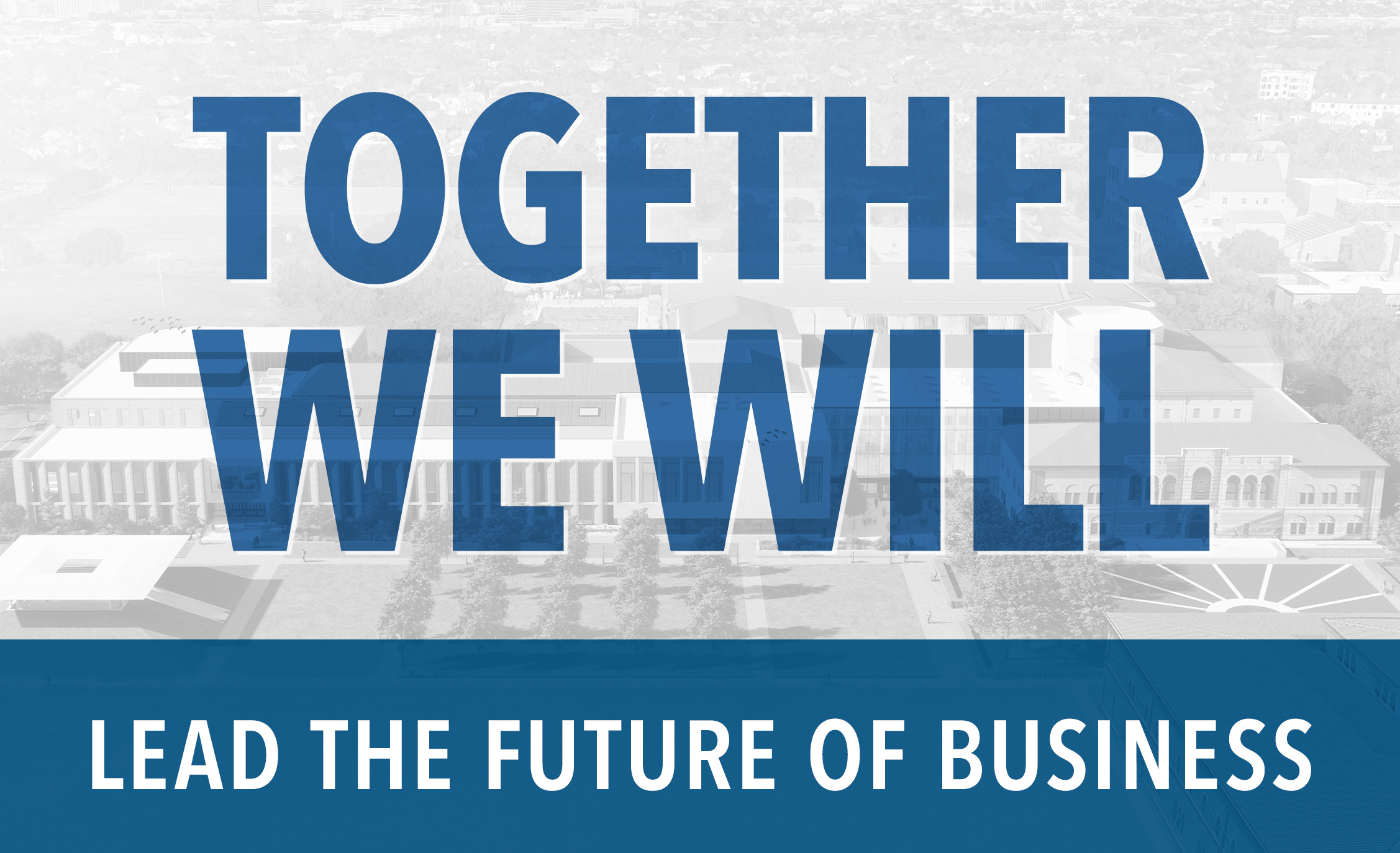
Our current brand campaign, “Together, We Will,” highlights the unique strengths and extraordinary potential of Rice Business. It complements our existing tagline, “You Belong Here,” and reflects our ongoing commitment to an inclusive and tight-knit culture with shared successes.
We’re a community propelled by curiosity and challenge, united by the boundless search for knowledge. We’re a lab and a launchpad for innovation, where collaborations fuel ideas and grow them into ventures that can change lives. Here at Rice Business, rigor and warmth coexist in the heart of Houston. We are Houston — the city of the future, home to anyone from anywhere who has a plan and the resolve to make it happen.
Rice Business is a home. Names and stories, struggles and jubilations, knowledge and what to do with it — we share it all in one place, on one campus in an oasis of trees. It’s the context for teaching and learning and research that touches real lives. It’s how we grow leaders who reach higher.
We are…
…a community of intellectuals propelled by curiosity and challenge
…a society of friends reaching higher together
…competitive collaborators, co-creating our individual futures
…citizens of a village within a town within a city that defines us
…a home, a family, a place to belong
…a base from which to launch adventures
…a catalyst for change that’s good for all
…creating the future with our emphasis on humanity: attentive, responsive and kind
We believe…
…learning to lead is a journey that starts with self-innovation
…rigor and challenge open new frontiers of self
…a small community is a powerful launchpad for big ideas
…a close community brings all hands on deck
…a diversity of perspectives yields far-reaching insights
…optimism opens the door to positive change
…you’re worth the size of the problem you can solve
Voice is Character.
It describes how the institution feels, acts and most important, it personifies our relationship with our online audiences. Voice is consistent across all platforms. It’s who we are.
Our Voice
Our voice is the voice of the Houston transplant who’s found a true home — and who still seeks new frontiers. The one who welcomes those who come after. Who makes their own path and takes you with them, watchfully responding to your needs. The one who thirsts for new knowledge that illuminates new experiences. The one who’s up for a challenge.
Self-confident
Full of heart
Curious
Open to everything and everyone
Inflected with a casual Houston friendliness
Tone is Mood.
It’s how we sound, constructed through style elements: vocabulary variations, rhythm, mood, structure. Just as our tone of voice changes based on circumstance and environment, your tone might shift a little to suit the content you’re creating or the platform on which you’re communicating.
Our Tone
Warm and Intimate
We welcome you in as a friend, tell you what you need to know and spill some best kept secrets.
Inspired
We know there’s something special here. We don’t have to persuade you — it’s in the words we use, the cadence of our speech.
Determined
We’re on a mission that’s both personal and communal. We tough it out because we want to see what lies beyond.
This section is a guide for maintaining a consistent and effective visual identity across various platforms. It outlines specific elements and guidelines to ensure that all design efforts align with our school’s brand. From color codes and typography choices to logo usage, this guide provides straightforward instructions to help you create visually cohesive materials that reflect the identity and values of our school.
When working with vendors to do screen-printing or embroidery, vector versions of the logos are needed. The vendor should be able to adjust the color as needed. As a reminder, these logos should only appear in RB blue, gray or white. Please reach out to marketing and communications with any questions.
Please see below for guidelines on how to use the logos for Rice Business, which includes the Jones Graduate School of Business school and the Virani Undergraduate School of Business. Please also follow these guidelines with our other logos. You can find logos to download here.
The Rice Business logo utilizes key elements of Rice University’s brand. Featuring the university shield and aligned with the university’s typeface and color palette, the logo maintains a clean aesthetic, ensuring unity and brand recognition. The examples shown below include the formal names of our graduate programs (Jones Graduate School of Business) and our undergraduate programs (Virani Undergraduate School of Business). The logo exemplifies our commitment to uphold the reputation of both Rice Business and Rice University.
Clear Space
Whenever you use the official Rice Business logo, it should be surrounded with clear space to ensure its visibility and impact. No graphic elements of any kind should invade this zone. Clear space is developed from the height of the owl in the logo and is shown as “x.”
Minimum Size
The height of the logo should not be less than 3/8 inch in any application, shown here in actual size.
We have three official logos that include school names, each corresponding to the specific program being referenced: undergraduate, graduate, or both. Additionally, we use a simplified Rice Business logo without school names for most general applications. Below, you'll find further guidance on how to use our logos appropriately.
We recommend using the Rice Business logo to represent the business school.

For admissions marketing and advertising, please use the "You Belong Here" logo.

If your communications focus solely on either graduate programs or undergraduate programs, you may use a school-specific template.


Formal communications that focus on the overall business school should use the dual-school logo.

Please visit this link to download the appropriate logo.
The Rice Business tagline is “You Belong Here.” It is meant to communicate and promote our tight-knit, inclusive school culture. Our tagline logo is most often used on admissions materials and in advertisements. (download)
![]()
The full color and single color logos can be used interchangeably, depending on the medium or context. The single color logos should be used for screen-printing, embroidery or when a background prevents the full color logo from being legible (i.e a photo background or a background that is too dark). We may remove the shield in instances when the medium won’t allow proper detail for reproduction of the shield (i.e. embroidery or a very small printed item). You can download logos here.


Those wanting to use any of the university’s logos or marks, such as the Athentian Owl or the Rice “R” pictured below, must get approval from Rice University Public Affairs or Athletics. You can find more information on the Rice University Brand Standards page.

We’re excited to support your student group’s visual identity. If you need a logo, our team is happy to provide an approved sub-brand lock-up that aligns with Rice Business brand standards. Submit a marketing request form here.
While we don’t create or approve custom logos, this lock-up gives your group a polished, professional look that reflects the larger Rice Business community.
You’re welcome to pair the sub-brand lock-up or the Rice Business logo with other graphics as long as the Rice Business logo remains clear, unobstructed and has enough spacing around it.
As you work to create your group’s visual identity, we kindly encourage everyone to help protect the integrity of the Rice Business brand by keeping these guidelines in mind.
Thank you for being great stewards of the Rice Business brand.
Logo Don'ts
These examples outline incorrect uses of our logo. Ensuring legibility and the use of brand colors are top priorities when integrating the logo into marketing materials.
Stretched, compressed or warped
![]()
Appearing in a color not in primary palette
![]()
Color combinations that make the logo illegible
Placed over a color not in primary palette
![]()
Placed over images that make the logo illegible or used over a photo in any color other than white
![]()
Recreating the logo in any way
![]()
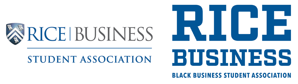
Sub-Brands
The sub-brand logo is customized for various departments, associations and clubs within the organization. A standard or collegiate version can be used. Logos beyond the sub-brand should not be created or used for any events, departments, clubs or associations. The standard sub-brand includes the Rice Business logo with a thin rule and the student group name below it in Trajan. The collegiate sub-brand features the collegiate logo with the student group name below it in Avenir. Club logos are available for download here.
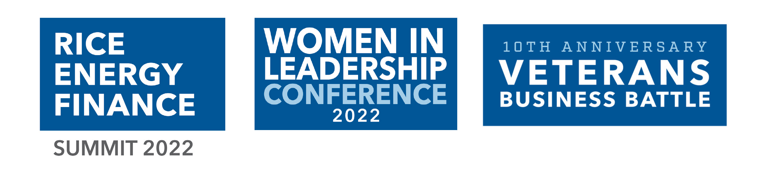
Student Conferences
Our major student-run conferences have standard wordmarks that are reused/updated from year to year. These include but are not limited to the Rice Energy and Finance Summit (REFS), Women in Leadership Conference (WILC), and Veterans Business Battle (VBB). No other wordmarks or logos should be created for these or other events. Additionally, the wordmarks should always be used in tandem with the Rice Business logo on all materials (email, swag, print materials, etc). The wordmarks should only appear in white, blue or gray. Conference committees wishing to use an alternate color must choose from our color palette and it should be used as a secondary, accent color to the core brand colors.
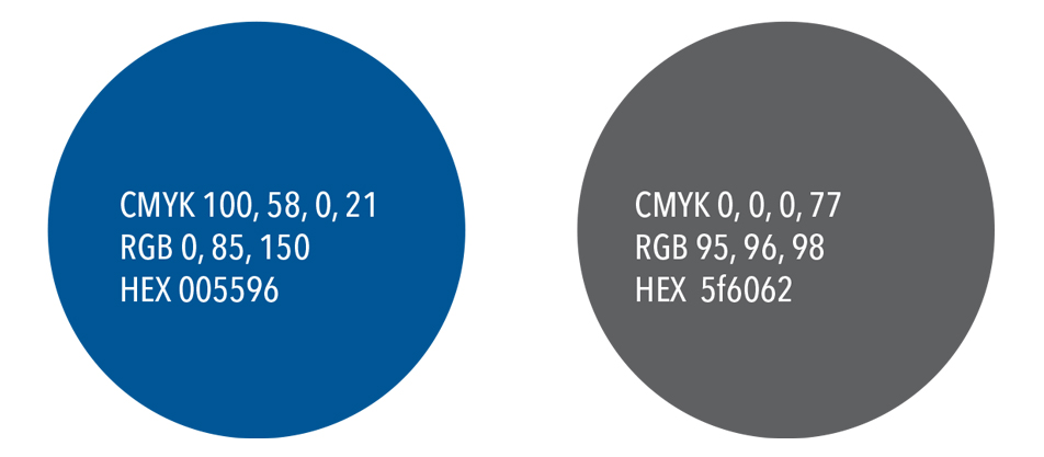
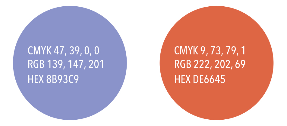
Primary Palette
The primary colors of Rice are blue and gray, selected in 1912 by Rice’s first president, Edgar Odell Lovett. The Rice Business logo should only appear in the primary palette (which includes white). We never use 100% black for logos, text or backgrounds, always this gray instead (77% black).
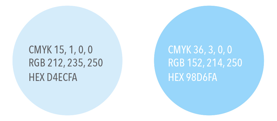
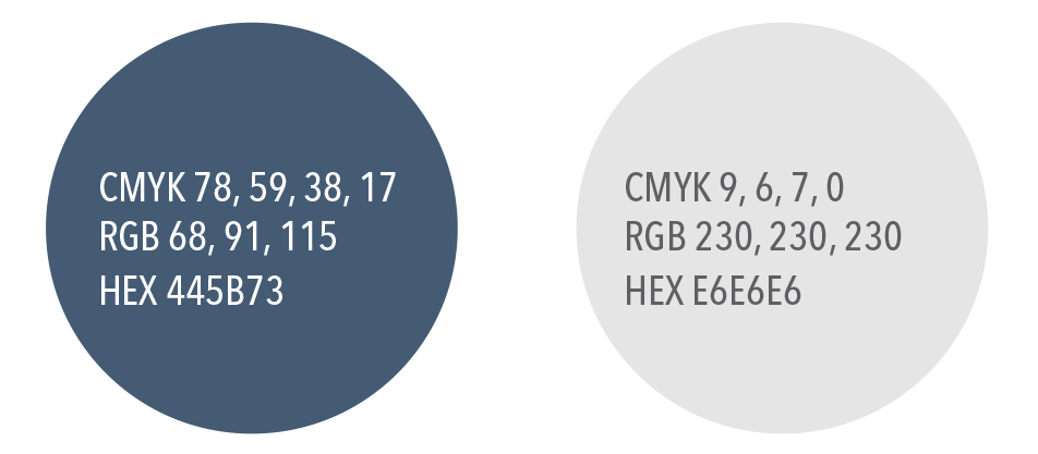
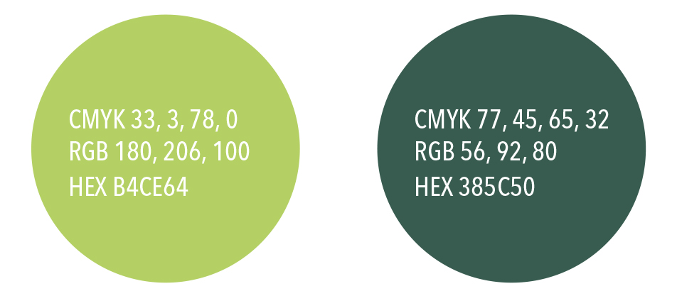
Secondary Palette
Inspired by the colors of campus, the secondary set of colors was designed to allow for a greater variety of color application while still complementing the primary palette. The recommended usage of these colors is as accents, not in place of the core school colors.
Example:

Avenir Next LT Pro is our primary brand font. The versions below are the primary styles that we use. We rarely, if ever, use the italic versions of the font.
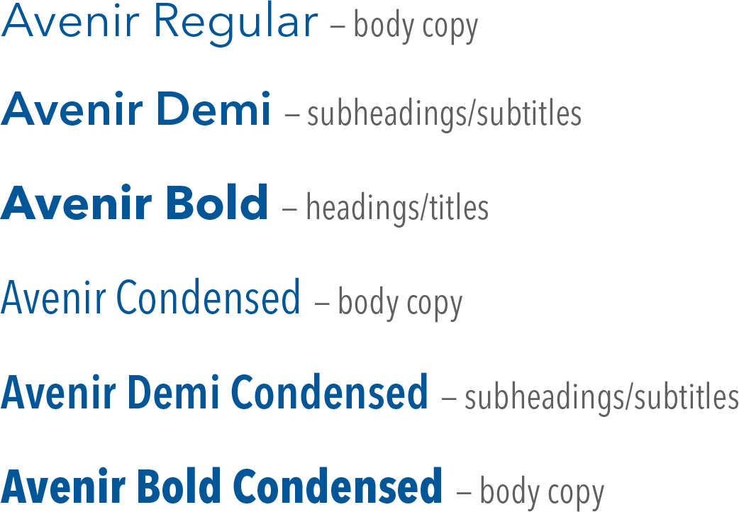

This font appears in our official Rice Business logo. It is often used in a more formal design context (ex. invitations and dinner menus) and is not typically used in day-to-day materials, aside from the logo itself. Using Trajan in close proximity to the logo is not advised.

This font appears in our collegiate logo. It is used in more casual design contexts, or when a stacked or square version of the logo is needed. It is also used for numbers. (ex. rankings graphics and celebration materials, statistic callouts, etc).

For use in Microsoft Powerpoint and Word, users without access to Avenir may use Arial as a substitute. Mac users may substitute Helvetica.

Proxima Nova is our web font, used exclusively for the website and for email.
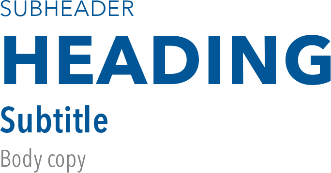
Sample Hierarchy
As mentioned above, Avenir Next LT Pro is our primary font. The primary font hierarchy is listed here. This hierarchy outlines the most common uses of the font for headings and titles, subheadings and body copy.


Website, Print and Advertising
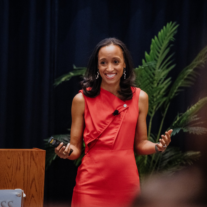
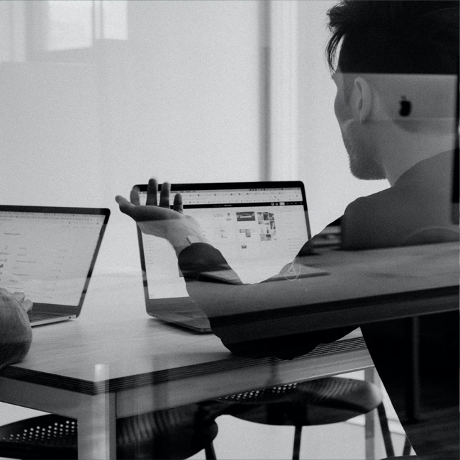
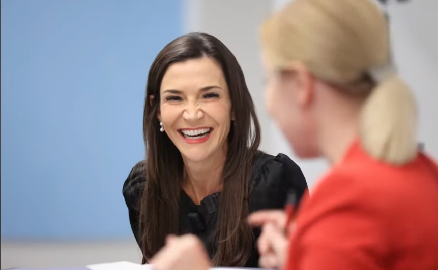
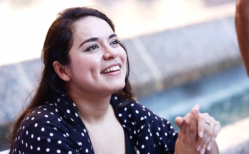
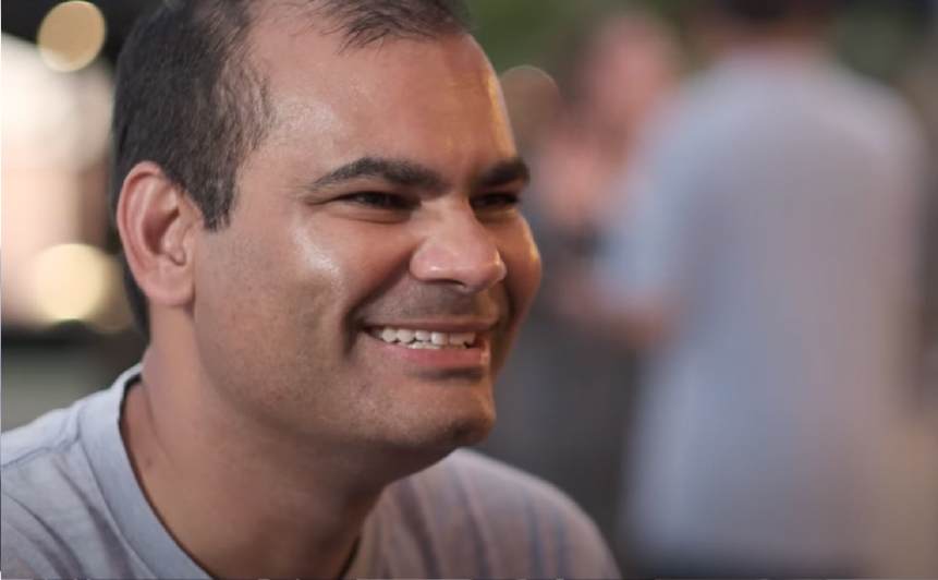
Photography is an expression of our brand and our photos should convey our brand personality — approachable, modern, optimistic and genuine. For website, print and advertising, photos should feel natural and candid. We should not use overly staged photos and rarely use photos of subjects looking directly at the camera. Stock photos should be used sparingly and should follow the same guidelines. To request a photographer for your event, please fill out the marketing request form.
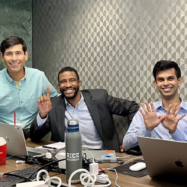
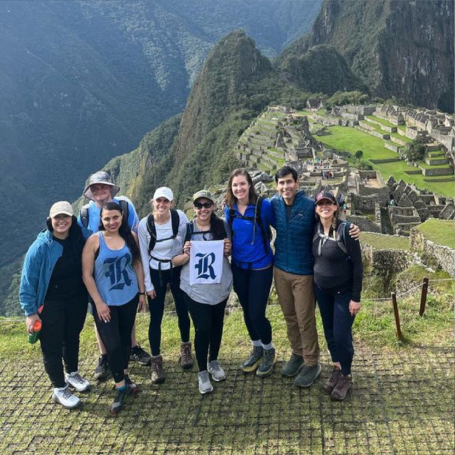
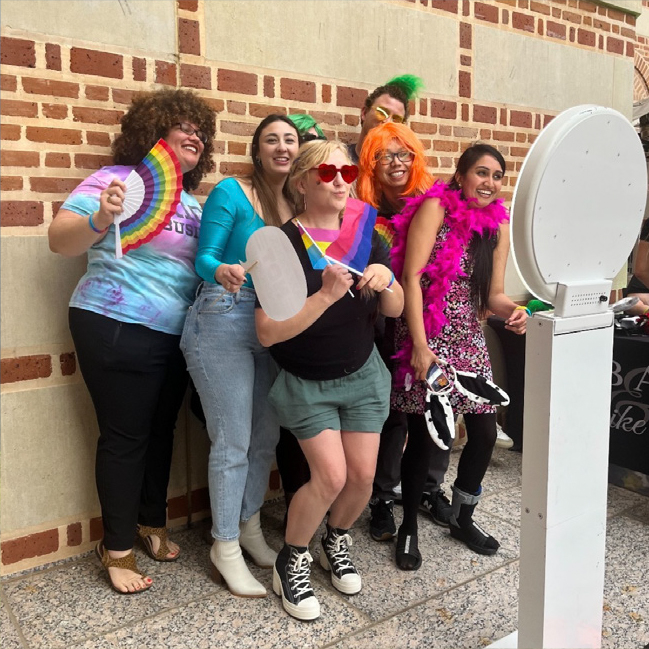
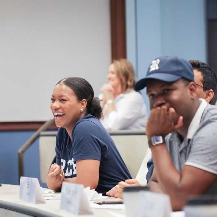
Social Media
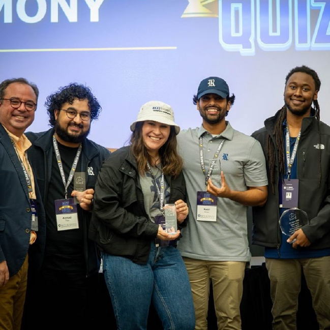
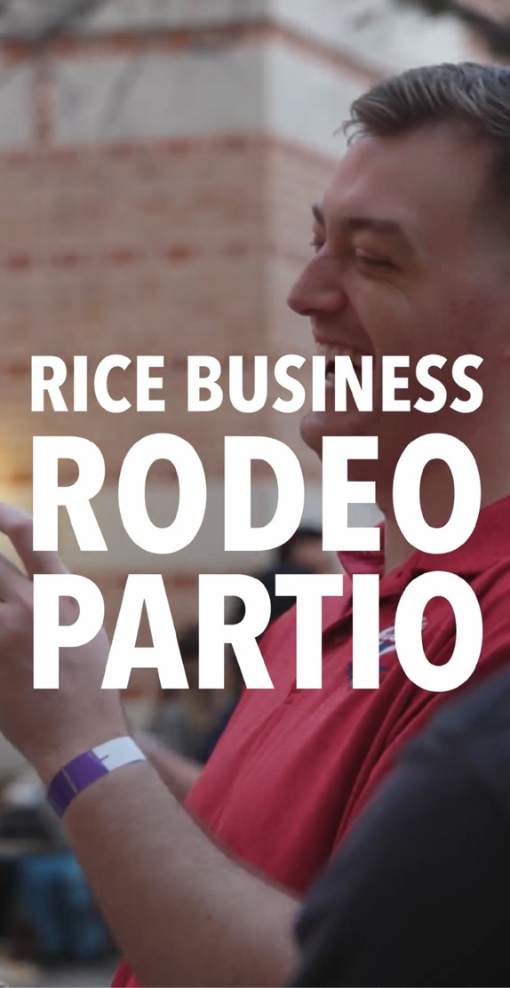
While we can use professional photos on social media when they’re available, photos for social media can be more casual (i.e. photos taken on smartphones or posed shots like the ones pictured above). The photos used on our social media should feel genuine and natural.


Rice Business Wisdom
We commonly use stock photography for Rice Business Wisdom. The photos should follow the same guidelines as above — they should not look overly staged and they should feel natural, organic and candid. While people can be the focus of these photos, we often choose photos that feel more abstract, focusing on environments or objects.

General Video Guidelines
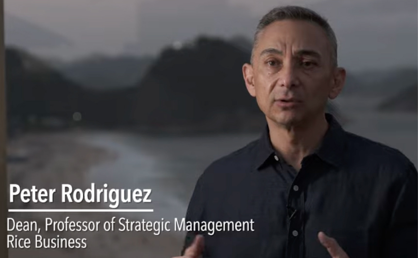
Like photography, video expresses our brand personality — approachable, modern, optimistic and genuine. Interviews typically use a two-camera setup with a shallow depth of field on the key camera. Stock videos should be used only when necessary and should follow the same guidelines. Interview questions should not be shared ahead of time, and scripts or storyboards are rarely used to ensure candid responses. Subjects should not look directly at the camera unless it is for a solicitation, instructional or similar video. Titles and lower-thirds should follow our standard format and use Avenir Next LT Pro. Videos should end with a logo card that includes the web URL.
Requests for video coverage and production should be submitted through Marketing and Communications via the video and photography request form.